Trends Affecting Website Design in 2018
Being a web designer in the technology industry where things are ever-changing and advancing to new levels, it’s really important to stay on top of the latest trends so that you or your business don’t become “outdated.” How does one stay on the cutting edge of web design trends and technology? How do you make yourself stand out as a designer and not appear as the ‘fresh out of college’ grad looking for their first job? Although this is a legitimate fear, you may discover it’s easier than you thought to stay up-to-date. Following web and UX design blogs, bookmarking new websites on design trends, and following some of the most successful designers/UX designers on Twitter are some great ways to keep yourself in the know. With that, let’s dive into the latest design trends of 2018.
1. Mobile First- As mentioned in a previous blog, designing for mobile has surpassed designing with a desktop-first approach. Mobile design has evolved to include hamburger menus which minimize the space taken up by menus and allowing for a content-first approach to the user.
2. Broken Grid Layouts- As a designer, you are always challenged with making a website stand out to a user, while drawing inside the lines of the grid system, so to speak. However, in 2017, broken grid layouts became a popular trend in website design. Grid layouts create clear, strict lines between elements of a website, keeping a clean simplistic look to it. Broken grid layouts allow text, images, and other content to overlap one another creating a more unique look. For example:
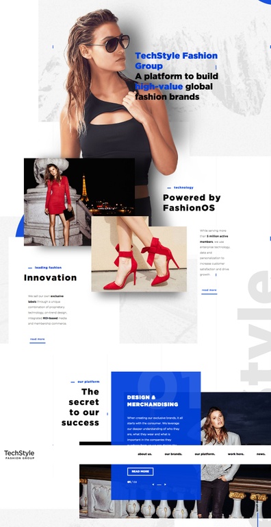
https://techstylefashiongroup.com/
3. Illustrations and Animations- In the past, using images to relate to the user and make them feel a personal experience has been a popular design trend. However, in the last year or so, illustrations and animations have become a superseding website design trend as opposed to images. Illustrations help bring pictures to life and also resolve the issue of a user possibly feeling like they can’t relate to your company or business if the images involve a specific race or gender. Animations can draw the users attention to a definitive place on the website, but shouldn’t be overused because it could potentially cause the user to feel overwhelmed. Below are a couple examples of animation-heavy designs, see them live here and here.
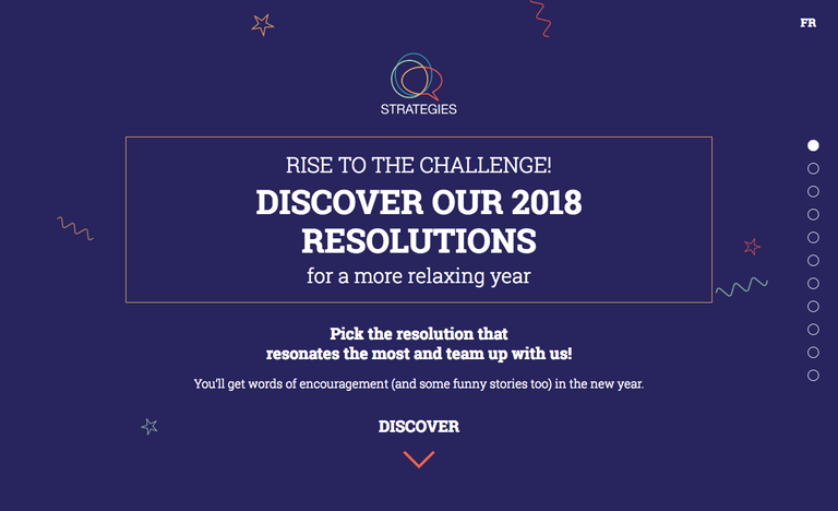
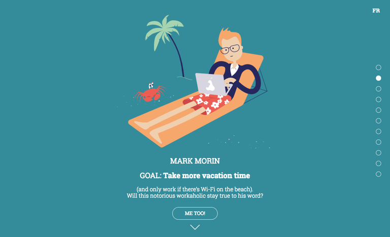
https://strategies.ca/resolutions/?local=en#Danielle
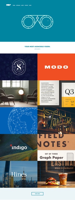
https://onedesigncompany.com/
4. Bold and Bright Colors- While the norm has always been to stick to “safe” and neutral color palettes on websites that aren’t extreme or aggressive to the user’s eyes, in the last couple years that has changed. It’s now a design trend to use bold, bright, and vibrant colors to grab your user’s attention and keep them engaged in your content. Using bright colors can help your website look distinct to a potential customer, grab a user’s interest, and set your company or business apart from others that your customers may be pursuing. An example of a visual language that uses bold colors would be Google’s Material Design which you’ll see in a lot of Android apps:
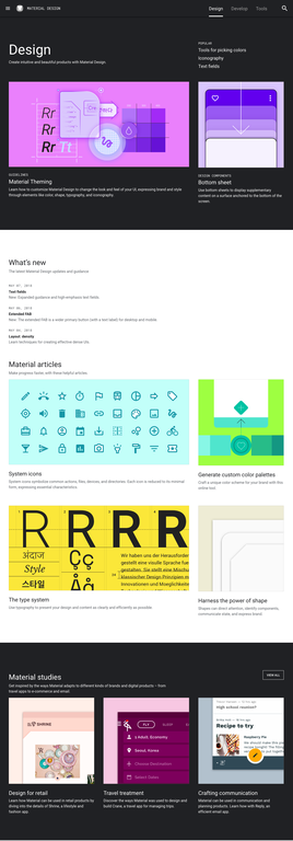
https://material.io/design/

https://apartostudent.com/
5. Typography- Another recent design movement that has surfaced is using bold and large fonts to give your website personality. A rule of thumb used to be to use small font text that wouldn’t draw attention away from anything else on the website. However, around 2017 website designers have taken a leap and started using larger and much bolder fonts as a main focus of a landing page or website to immerse the user into content. You’ll see this used especially in header areas over images and videos, as well as in titles throughout the site. In addition, serif fonts are also making their way back into being a popular font choice, instead of sans-serif. As screens evolve and have better font support, we are starting to see more out-of-the-box and serif fonts used.
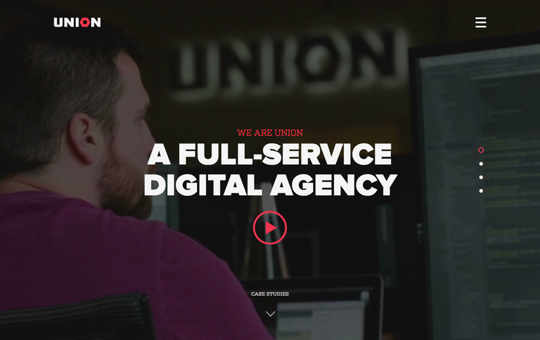
https://union.co/
6. Diagonals, Slants, and Asymmetrical Lines- In 2013, responsive web design became the new ‘must have’ for websites as smartphone usage began to rise and surpass the use of desktops. Today, web designers are coloring even further outside those lines of the grid method and following straight clean lines, and are including diagonal lines and oblique shapes in order to be more creative. Although this is a very popular design trend and can help your website stand out, it should be used minimally in order to reduce the chance of overdoing it and distracting the user.
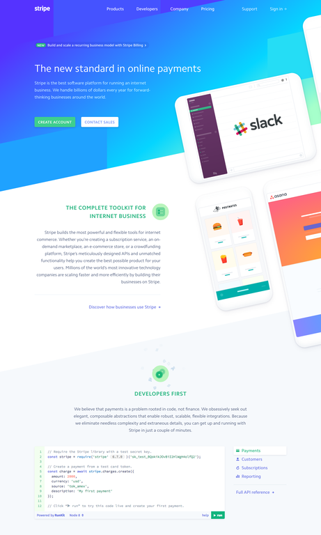
https://stripe.com/gb
The Takeaway: Website designs are taking a huge leap from the norm into bright colors and animations, asymmetrical and broken grid layouts, bold typography, and more in 2018! If you stick with it, keep an open mind, and stay on top of the latest trends in your field, it’ll be amazing how you can not only observe, but evolve WITH the things that progress in your career. Never assume or think that what you know is enough. Never stop learning. And most importantly, never stop believing in what you can accomplish and being passionate about what you do.
