Flat Design vs. Material Design: What's the Difference?
by Emily Wiedoff and Becky Swan
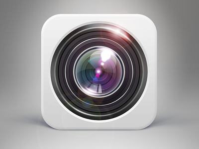
Design trends come and go, but the ones that have been dominating the internet for the past few years are flat design and Material Design. These two styles are similar, but have a few differences. They’re a stark contrast to skeuomorphism, a style used since the advent of computers that helped bridge the gap between the real and digital worlds by using realism and details to mimic real-life objects. Skeuomorphism was embraced by Apple for many years.

An example of a skeuomorphic app icon from Seven on Dribbble
However, with the increased usage of mobile devices and varying screen sizes, a change was needed. These visual metaphors were also no longer needed as a generation of digital natives became the primary users of these new technologies. Flat design was fully embraced by the design community when two huge technology companies released their versions: Microsoft with Windows 8 in 2012, and Apple with iOS 7 in 2013. Flat design has since guided the visual language of the internet and continues to evolve. Material Design can be considered an evolution of flat design.
Flat Design
Flat design is a design style that emphasizes a minimal use of stylistic elements that give the illusion of dimension and depth, such as drop shadows, gradients, reflections, and textures on items in a website or app. It is defined by the use of flat colors, typography, and iconography and often appears simpler and minimalistic.
Pros:
- Speeds up load time of the website or app and focuses on raw functionality
- Looks more consistent across devices and screen resolutions
- For designers, easier to make sites responsive for multiple devices
- Uncluttered with fewer distractions for the user to consume content
Cons:
- Limits the designer to iconography, typography, and colors
- A simple and minimal design can make the site look generic and not stand out
- Lack of visual cues like shadows and depth can lead to usability issues

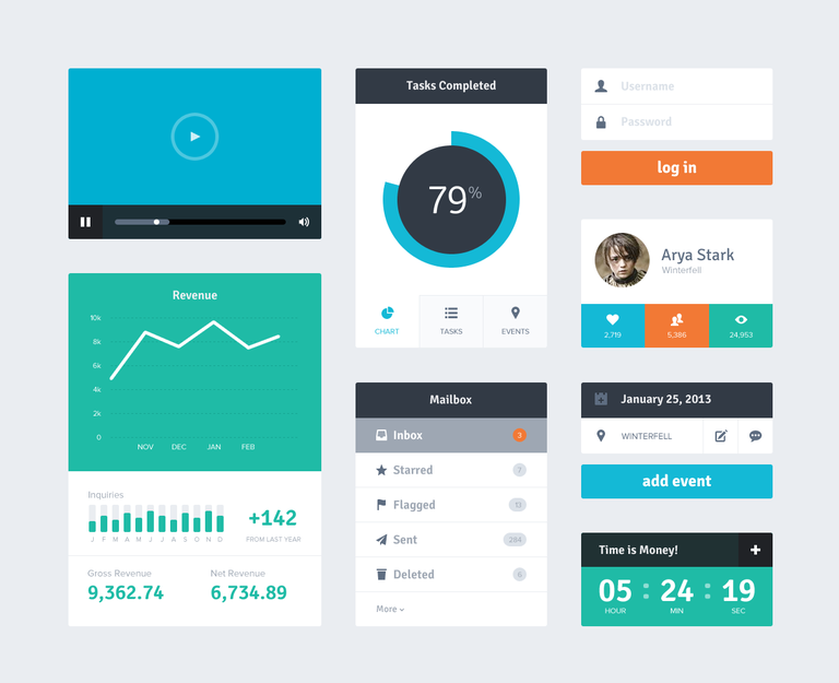
Flat UI Kit by Riki Tanone on Dribbble
Material Design
Material Design is a visual language developed by Google in 2014 that includes three-dimensional interfaces composed of layers of “physical” components with high-contrast colors, animation and motion, and depth effects. Each layered material object is laid out on a flat surface, giving content above it such as buttons, typography, images, etc. a sense of depth.
Material Design was developed by Google for use in their Android mobile operating system and app design. Material Design provides a strict set of guidelines to app developers when building Android apps. Google has since expanded its use to its websites and web apps like YouTube, Gmail, and Google Drive, and the rest of the web community has begun to incorporate aspects of Material Design into website design.
Pros:
- The three-dimensional design makes the website more user-friendly and easier for the user to interact with and understand
- For designers, Material Design comes with specific guidelines which are beneficial when building the design
- Material Design provides a unified experience across all platforms
- Motion and animation reinforce users’ actions and provide feedback
Cons:
- Material Design is tightly aligned with Google, so if you want to distance yourself and create a unique identity, it’ll be more difficult using Google’s guidelines
- Animation can cause slower load time and drain mobile batteries faster
- Forcing app developers to stick to specific guidelines might cause slower development time and lead to less individual creativity

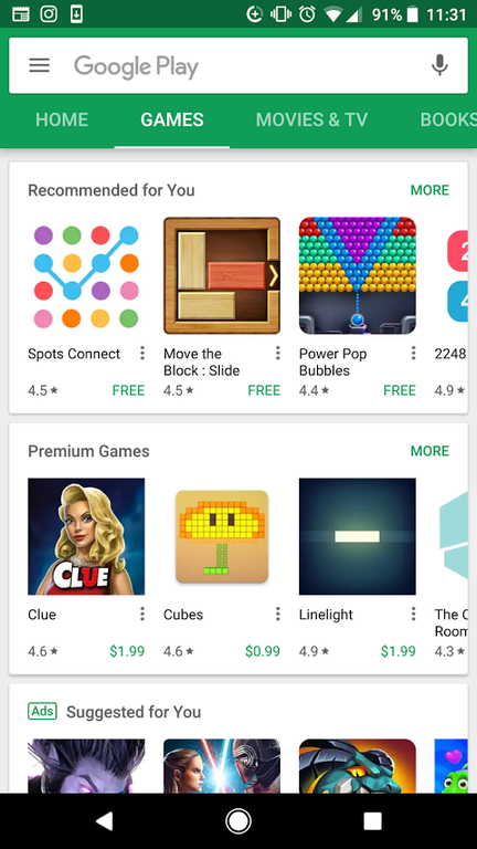
Google Play Store
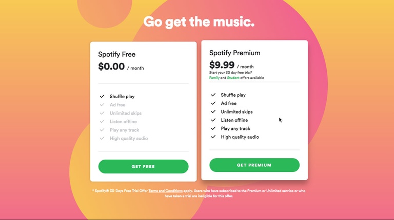
All in all, Material Design isn’t too different from flat design. It simply adds layers and dimension to those elements and provides more clues and feedback to the user. Material Design was built on the basis of best practices and usability. Both flat design and Material Design continue to evolve as designers experiment with emerging technologies and trends. For example, Spotify (image below) adheres to a mostly flat design style but has incorporated gradients, subtle shadows, and Material-like transition effects.
At Wildcard Corp., we use a mixture of both flat design and Material-like design (Material-like because we don’t necessarily follow the strict guidelines provided by Google), because we value clean and concise websites but also want to make sure we give our users the best experience we can. There is no right or wrong way to design a website, but it’s important to be consistent in your design.

