Basic Integration of Twitter Bootstrap
"Bootstrap is a free and open-source collection of tools for creating websites and web applications. It contains HTML- and CSS-based design templates for typography, forms, buttons, navigation and other interface components, as well as optional JavaScript extensions. It aims to ease the development of dynamic websites and web applications."
Get Bootstrap
There are two ways to integrate Bootstrap into your site:
First, you can go to Get Bootstrap and download the Bootstrap theme locally. The more attractive option would be to link to the content delivery network (CDN) directly in your HTML. See below. This will allow for quicker updates to newer versions and boosts performance on your site.


Bootstrap's Classes
Integrating Bootstrap can be as easy as adding predefined classes to your existing HTML. You may need to refactor some of your code, such as adding div tags around content, to ensure best practices. Below is an example of formatting a button component.
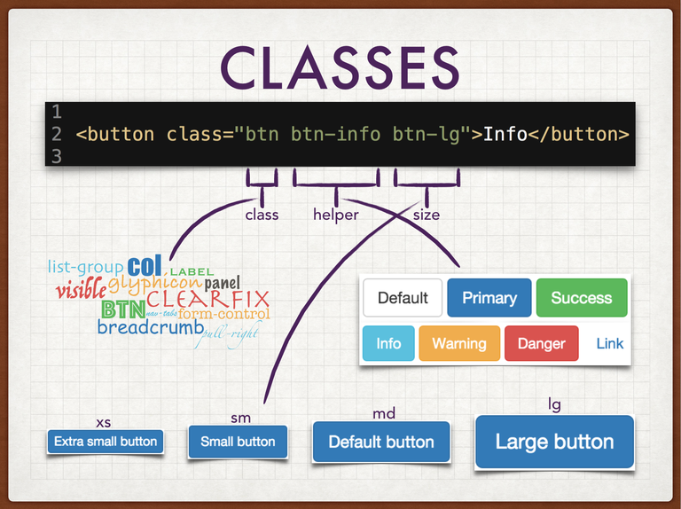
Within the <button> we need to add the class attribute. Since we want our button to look like a button, we add the btn class to tell Bootstrap to format it as such. Next is the helper class. Helper classes do things like change the color of a component, do some quick floating or alignment, and other appearance-related things to components. Here we want the button to be a Robin's Egg Blue color so we define the helper class as btn-info, meaning the info color will affect the btn class. Finally, we want to change the size of our button. Not all Bootstrap components allow size classes but ones that you'd like to resize, generally do. This last class will, once again, be comprised of the component it's affecting and the size you'd like it to be. We chose to add the btn-lg class to make our button the largest size. Note that medium is the default size so you do not have to add btn-md to make a medium-size button.
Bootstrap's Grid
One thing Bootstrap does very well is making it easy to layout your website with nice, little rows and columns. It does this with the fully-responsive, twelve column grid system feature. There are a few things to remember when it comes to using the grid system. Primarily, you must wrap row classes with either a .container, or a .container-fluid; and secondly, you must wrap column classes with .row.
Below are just three examples of formatting columns. There are endless possibilities when it comes to column sizing. As long as all columns or "column-column offset" combinations add up to twelve, you can pretty much do anything you want.
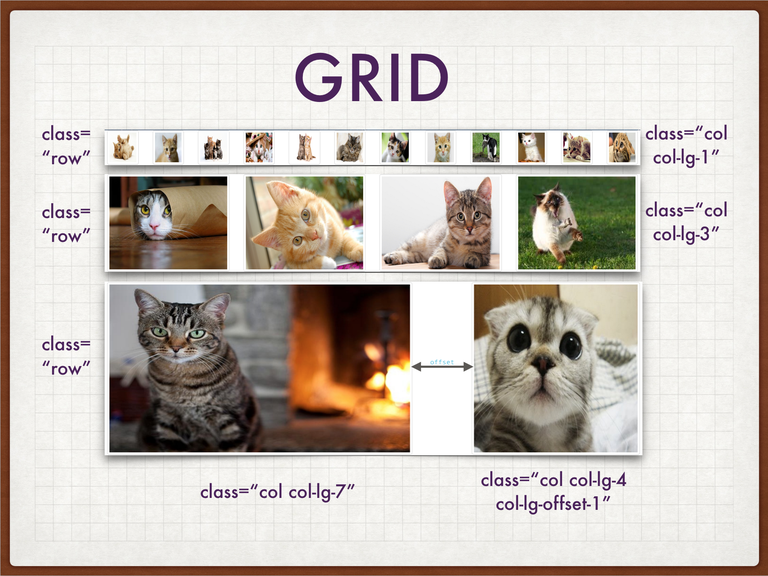
The first row demonstrates using the col class to create one row of twelve columns. You would first define the col class to let Bootstrap know you want a column. Next, we define col-lg-1 to tell it that we want one image to take up just one of twelve columns. We would repeat the process within this row until we have either twelve images that are one column wide, or enough columns to add up to twelve.
The next row is very similar to the previous one. This is an entirely new row of columns so we first need to create a
row class. For each of the four within this row we use the classes col and col-lg-3. Four images x column-size three = twelve.
Finally, we want to create one last row <div> with two columns but the last col will be offset from the first one. The code for this one looks like this:

One last thing to touch on is the lg part of the col-lg-# class that we've been using. This just means that whenever you're viewing this on a large screen size (≥1200px), Bootstrap will use the column sizes you defined. What happens when the screen is smaller?...
Responsiveness
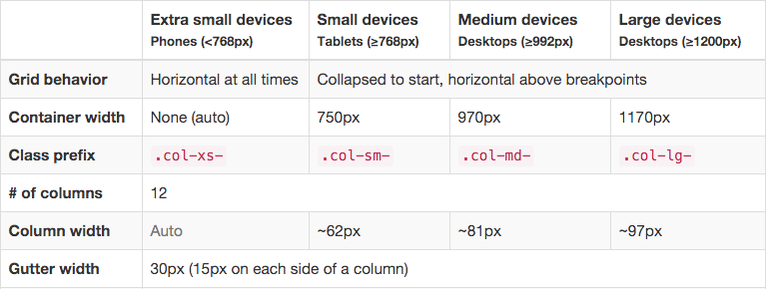
Bootstrap's grid system uses media query breakpoints to size their columns. This table comes straight from Bootstrap's website and defines all their standard breakpoints, sizes, and prefixes.
Using these breakpoints, you can set a customizable layout for any size device.
Demo
This is a generic "Learn to Create Websites" page from Tutorial Republic. At the top of the page it has some navigation links that should be collapsible on smaller screen sizes. It has different size headers, paragraphs, links, and a footer at the bottom. Let's see what happens when we link the HTML for this page with Bootstrap's CDN.
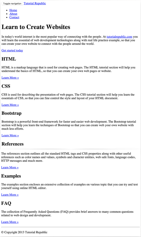
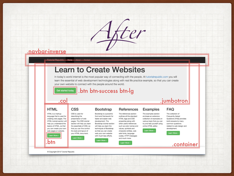
In this "After" slide you can see that the site has been completely transformed just by adding some classes. Those ugly <ul> items at the top are now a nicely formatted, responsive .navbar as the header of the page. The content that the site's author really wants to showcase is now housed in a big, eye-catching .jumbotron. All links that were previously generic, blue, underlined hyperlinks are now bright green buttons that will guide you to "Learn More". Each of the sections divided by smaller headers are now in a neat .row of separate .col that puts them all in one place so the user doesn't have to do any scrolling to take in all the information. Lastly, at the bottom is a sticky footer that nicely balances out the top navbar.
Customization
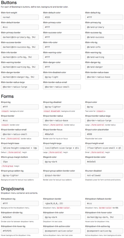
A really handy Bootstrap feature is that it allows you to take any tiny detail that it typically styles, and customize it to fit the theme of your website. You can change the color of virtually everything, you can change any aspect of typography, adjust padding, border-radii, table cells, even the number of columns in the grid. The list goes on and on. When you've finished tweaking the easy-to-use form they provide, click the bottom "Compile and Download" button and you're good to go!
Conclusion
This is quite a basic demonstration of integrating Twitter Bootstrap into your website. Bootstrap itself has many really excellent features with excellent documentation to take you step-by-step through all its components. The classes they feature on their website is not exhaustive but a quick Google search can find you full lists of them. I hope this information will at least get you started on your Bootstrapping journey!
